Friday 17 March 2017

Evaluation of e-portfolio


I have developed my skills in numerous ways during this project, expanding my textile knowledge creating prints using different methods. I also re-looked at my presentation skills as all the pages in my e-portfolio were mainly already there I just had to place them in an order based on my contents page.

This project I think highlighted my strengths to the best of my ability as I was able to focus on the type of work that interested me. I haven’t really reworked a lot of my work as most of that was done in my hard-copy portfolio although; I did make amendments to some CAD based work with my CAD tutor as I felt this was the best time to do so. My moodboards were the main focus to rework; I did my Earthy Minerals board for the second time as I had learnt new CAD skills on Photoshop so I used the clone tool to merge very few photos together, I liked the effect this gave.

As I am applying for courses Textile related, I found that I had done a lot stitch samples and weaving samples, I felt I needed to push my knowledge further by creating prints as this was a big part of my university course. I am particularly pleased with the prints outcome as I had never experimented with this sort of textile work before. I think this project looks professional as I did have help from a technician surrounding this profession.  

Some work that still needs to be improved would be my overall annotation of work, I think I could have explained my work in better detail explaining the actual process of things. I find descriptive annotation quite difficult and would like to improve on this.

I think in terms of the e-portfolio I managed my time quite well as I was able to get it completed before the deadline. However the written work was left till the end of this project as I was so focused on finalising my e-portfolio.


Changing an Images Colour

To create this image I made sure that the masked area was shown then clicking the colours in the preview window until they were visible. The eyedropper tool was used to add more colours. 
I then copied both the original photo and new coloured photo into PowerPoint. Once I had done this I chose the option to fade the image in for 1:50. I like this effect as it would help me to build my portfolio with a type of animation also. However, the image that I had chosen personally did not benefit from this effect. 
I think if I had used an image that needed to be dramatically changed this could look effective. If I were to do this again I would change the colour of the garment on a person as this could look current and show the progress of an image through colour.  


Screen Printing and Heat Press Printing

This is a technique that we do not do on our course as part of any of the modules, but it is something that I was interested in trying. Luckily, we do have the facilities and I was able to go and make my own screen. I also used the heat press with magic touch image transfer paper to combine another technique that I had not used before. I then worked into the piece with my own style of embroidery and beading to create a layered piece with lots of depth.


Mixed Media - Drawing with Stitch

This is work that I have completed in my first year. I did not feel that this work needed much improvement apart from making the pieces sit together as a pair better. In order to do this I decided to cut all of the black fabric away from one of the pieces and re mount it onto calico so that it matched the other piece.


Drawing

In the first year I did a life drawing class to develop my drawing skills. This also helped me to expand my skills with drawing figures and thinking about scale and proportion in particular. Since gaining more confidence and expertise in these areas, I have reworked these original drawings and created an improved collection of studies. I also did one with watercolour to use different media’s to draw with and push myself out of my comfort zone.

Premiere Vision - Unexpected Variations

This was a personal project that I decided to do as it is a textiles based event that I know a lot of universities take part in and create work for, so I wanted to become familiar with it. I looked to the Premiere Vision website for the trends that they had set for Spring/Summer 2018 and I found one called ‘Unexpected Variations’. 
I knew that I wanted to experiment with weaving and thought that this trend lent itself really well to this technique. It would enable me to try different materials within the weave, therefore creating unexpected variations. 
After carrying out further research I found a weave artist called Elizabeth Ashdown, she was a great inspiration during this project because she is adventurous with her work and creates unusual pieces. I have included images of her work on my mood board which I have created on Photoshop.


Personal Project - Blurred Florals

As one of the first projects that I focused on in the portfolio process I wanted it to be a textile sample as throughout my course I hadn’t focused on textiles. After researching trends for 2017 I came across a floral style to focus on, I wanted to expand on this so I came up with the idea of ‘Blurred Floral’. To start my inspiration I made this mood board using photos that linked to the theme. From this, I have taken inspiration from the images and created the samples.

The samples that I have made include experimentation of different techniques. These were Suffolk puffs, dying fabrics using real flowers, and manipulating fabrics dyed with vegetables. I then used these samples to create a collection of designs using Photoshop. I did this to see what the techniques would look like if they were made at a larger scale and used on a real garment.


Sustainability Sketchbook Work

This was work from my sustainability project that was based on futuristic / iridescent future design. I included this because I wanted to show a visual of how I work. I scanned in pages from my first year and applied them to a Photoshop document making sure all the pages were straight and of equal size.


Earthy Minerals

I included this project from one of my first year projects as I like the overall outcome of my work. However, I did have to modify and adjust some things this year to make it slot in with my current work skills. I had to re-do this moodboard because in my first year I did a hand-rendered board but I think there was too many pictures, to start the new board I only used six images and placed them into a Photoshop document. I cloned / merged some of the images together to give the illusion of all the images being one. 
For more inspiration I created this sample board with a piece of textile work that was stitched together using naturally dyed fabrics, bundled up fabric and handmade sequins. After the workshop with textile designer Emily Notman I made a textile piece using her style of work dying fabrics and stitching her way. The outcome of this looked similar to the stitched sample that I had done myself so I added it onto the board with this. 
Designing was next so I picked designs that I thought were strong for my first year of fashion and drew them up using my figure template that had been used throughout. I scanned them into a Photoshop document and added a faded out background for ascetics.
The final part of this was a photo-shoot that I re-did to fit the Earthy Minerals theme, editing the chosen photo on Photoshop I selected the area I wanted to focus on and using inverse I was able to fade the background so it wasn't as prominent and the garment was the main focus.


COS Promotional Campaign

As well as textile work, fashion designs and drawing I also wanted some Business / Promotion within my e-portfolio. By adding this COS promotional campaign it shows skills not only from CAD based work but also photography as before all of my promotional material was finalised photos were taken to apply in my look book. I did not edit or adjust the images on Photoshop as I tried to get the images perfected when taking them on the camera to save me time. 
However I did create my whole look book using Photoshop and designed it page by page labeling each one as I went on. I found this the easiest program to use when creating my promotional work as it allowed me to be creative with text and imagery. 

Coohem Editorial

My magazine editorial is about a company / brand called ‘COOHEM’; it is a textile based brand as much as a fashion and clothing brand. I picked Coohem to focus on because I have been influenced by a brand that uses textiles as the main bulk of their production processes. I feel strongly towards this brand as fabrics are dyed naturally by the manufactures themselves of which Coohem claim they work closely with to create technical, innovative garments. Preferably I am more attentive to the fact that the overall garment isn’t a big concern it’s the fabrics, knits and yarns that are all main priority.
This brand has allowed me to broaden my horizon to the importance of fabrics when garment making.I used Photoshop again to manipulate my images and add in my text that I had written about the company. I started by gathering images I wanted to include feathering them so the edges would blend and cropping them to fit. Using the define pattern option I filled shapes with images of yarns and other relatable imagery. 

FMP - Suffragette

The next project is my FMP I feel this was a strong second project to focus on because of its content being something I felt strongly about. The first board relating to the project was my moodboard; I created this using Photoshop, building photos on top of one another until it worked.
 Which lead me to design my trend board also using Photoshop however; I added hand-rendered detail to the board to help picture the texture and pattern that I may create on my garment. Colour swatches were stuck on to the board using my own knowledge of the colour palette that I wanted to use. To add to this project and build a substantial portfolio I used this research to create designs as this was a part of my brief I drew 19 designs but only half were applied to a Photoshop document; drawing them and using Pro-Marker pens to colour them.
Having to decide on a line up was not the easiest of tasks although, after picking the three I might consider making I drew them up  and filled them with the exact colour of the material I wanted to use for my final garments. 


Hand & Lock 'Holi' Project


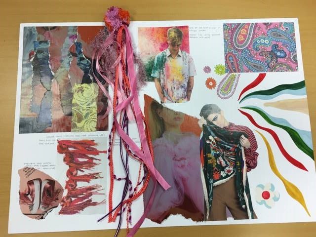
The first project that I focused on in my portfolio / e-portfolio was the Hand & Lock Celebration brief. I focused on the Celebration of Holi as I wanted an original and dissimilar visual outcome. Firstly, I created a moodboard to help the research of the theme and to gain a better understanding of the celebration itself. I used images from magazines and the internet to gain my research I focused on bold shapes, hand prints, painted elephants in Jaipur, India, fashion and Gods.
This was all supportive information for my development board which was a process of testing out my thoughts and processes for a final piece before applying them to a final design. On my Development board I used my knowledge of colour to express the celebration. Creating my own pom-pom, painted patterns and self-dyed material. I used annotation to discuss my ideas as well as representation through imagery. I used primary research also using Rangoli powder and throwing it onto the shirt that I would be using for my final piece, taking photographs to also add to my development board.
 The final photo shown is an image of my final piece additionally I had applied most of the exploration I had done on to the garment. I focused mainly on the collar and pocket trying to give the visual of an exciting and bright celebration. 


Friday 10 March 2017

Contents Page

After researching many different variations of contents pages, it was clear the contents page I would design would be creative. Showcasing my creative flair I wanted to show the order of my portfolio through imagery.
The first thing I looked at was how to place my images so the aesthetics were good; I chose a hexagon shape to fill with small pictures of my work for an interesting effect. I imported an image of the shape I wanted and each time I added a photo I would merge it in to the shape using my knowledge of Photoshop - explained further in my folder.
I think this contents page was a success, since attending interviews it has been a well achieved talking point as I think it has turned out professional and a good way of starting my portfolio.


Introduction

My e-portfolio is an important part when furthering my education at one of my chosen universities. All of the work within this blog I have included in my portfolio, so has been what I show to the universities in my interviews.
Some universities that you apply for may ask for an e-portfolio - a digital way of receiving your work. For example Leeds College of Art asked to see six pieces of my work before I received an invitation of an interview.
In this blog I will be discussing my work; what it is? why I created it? how it links to my chosen career pathway?

For my final e-portfolio I have put my images on to a PowerPoint document and have created a folder of research into why some of the work produced was not chosen for this document.